Corrigan COM210 Blog
Friday, May 10, 2013
Brochure, Business Card, Letterhead
For our final project we were to create a brochure, business card, and a letter head for our imaginary business. I enjoyed doing this project as it involved just being creative and messing around with different functions with In-Design. My business is based out of Cincinnati, Ohio as that is my hometown and I play baseball. Also my color scheme for my project was centered around the Cincinnati Reds, pro baseball team. I had a lot of fun doing this and hopefully you like it.
Monday, May 6, 2013
Realistic Design
For this assignment we were meant to take a realistic picture of something or someone and recreate it, drawing from scratch. I chose a picture of one of my favorite baseball players of all time, Ken Griffey Jr. I had a lot of fun doing this assignment though it was very hard to get all the lines I wanted to make it look realistic. It was also very hard to know which lines to create in order to make his expression(happy) to seem realistic. Though in the end I believe that this project turned out pretty cool.
Monday, April 29, 2013
Corporate Identity for "Rounding Third Training"
1)
What is your business?
Training facility for growing and improving baseball players.
2)
Describe your business in one sentence
We train serious baseball athletes to improve their skills and help them become the best player they can be.
3)
Who is your target audience?
High school, College, and Professional athletes. Basically a high caliber of players.
4)
Who are your competitors?
Other baseball training facilities, personal coaches, personal trainers.
5)
What makes them better/worse than your
product/service?
It is a unique business sector that I will be going into, as my competitors offer something similar but without the exclusive focus particularly on baseball. Personal trainers can help you get strong but often don't know the right areas of your body to train. Personal Coaches are great as well, but they do not offer a workout regimen or strength training. We combine the two with top notch facilities.
6)
Do you currently have an identity? (This is more for companies that are already
established and you’re just revamping the logo/corporate identity. If you have a new company or product, skip
this question.)
N/A
7)
(If your answer to #6 is no, skip this
question) What do you like about it and
what don’t you like about it?
I like the exclusiveness of the facility, and the boldness of the identity. People will know that the training facility is focusing only on baseball.
1)
How do you want your image to be seen in two
years?
I want our company to be seen as a serious training facility for high end athletes. People will know that it is the premier training facility for baseball in the area.
2)
If your company was an animal, what animal would
it be and why?
It would be a lion, but my mascot would not be a lion.
3)
If your company/brand was a person, who would it
be and why?
Ken Griffey Jr. because he was my favorite baseball player while growing up and he is a natural.
4)
If your company/brand was an object, what would
it be?
A Baseball bat, or Baseball.
5)
If your customer was a cartoon character, who
would it be?
Bugs Bunny, because he used to be pretty dang good at baseball in a couple of his cartoons.
Wednesday, April 3, 2013
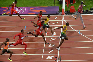
Usain Bolt Who?
So this is me just killin' it this last Summer vs. Usain Bolt. I mean the guy thought he had a chance so I showed up in my baseball uniform and even put on a helmet to create air drag and give him an advantage. Needless to say the picture says it all. This is a photo of the finish line as I am just coasting home into first place. You can see Usain looking over at me as he is about to enjoy a face full of celebration. I had a lot of fun using Adobe Photoshop for this project as I always find these types of photos online hilarious. But seriously, I actually did win this race.... then I woke up.
Wednesday, March 20, 2013
T-Rex/Dog/Soccer Player
This was a cool background I thought for him to remain white. I do plan on adding some color to him ut he looks pretty cool right here. I love how the T-Rex is wearing a tie, pretty sweet.
Wednesday, March 6, 2013
Final Logo
This is my final Logo for my Baseball Training business. I themed the logo ultimately around baseball obviously and I used the Red/Black/White color scheme because I love the Cincinnati Reds, my hometown team. I liked the Font I used for the R3 because it wasn't symmetrical and had a nice kinda old time flow to it. Also the rectangle in the background represents a pitching rubber, and that blends nicely with the triangle which gives it the illusion of a home plate. A baseball in the center completes the empty space in the triangle. I liked the look of when we did the picture made of words so I incorporated it into my logo by having "Rounding Third Training" make up the triangle. I had a lot of fun creating the logo!
Monday, March 4, 2013
Subscribe to:
Comments (Atom)
.jpg)


